The Art of Slide Design: Make Important Information Stand Out


This post is part of The Art of Slide Design series. In each post, we look at a design principle to understand how to create more compelling slides. This week we'll look at making important information stand out. Follow along and subscribe to my newsletter to get regular tips to improve your slide design and other posts about speaking, management and employee evangelism.
In high school, I had a brilliant history teacher. History could have been a subject I struggled with, but my teacher had a brilliant way of presenting. He rarely made us read directly from the books - instead, he'd tell stories of what we were learning, and as he went along, he'd make notes of what he was saying on the sheets of an overhead projector. His stories brought history to life for me, managing to paint a picture of times long gone by and allowing us to understand our pasts. Which is exactly what you'd hope from a history teacher. But what at the time I never realised was how much I learnt from his note-taking.
Without interrupting his stories, he'd jot down the important highlights, creating his notes on the fly and allowing us to see and pick up on how he did it. He'd use a red pen for dates, a green pen for important names and phrases and a black pen for everything else. We were all encouraged to follow the same format in our notes and to use that colour coding as a way to structure information. He not only taught me history, but he taught me how to take great notes and how to make them memorable. I still to this day sometimes recall specific historic dates in my mind in red because of this!
Using things like colour to highlight certain information and make it more memorable, that's what today's blog post is all about.
Our second slide design principle is: to make important information stand out.
So again let’s go back to some theory (from Universal Principles of Design).
von Restorff effect:
Noticeably different things are more likely to be remembered than common things.
Universal Principles of Design: Lidwell, Holden & Butler
This is the phenomenon that when you're presented with multiple items that all look the same, the item that differs from the rest is more likely to be remembered. This is about making things look more unique or distinctive, so that it stands out more and that people will remember them.
This is basically what the definition of contrast is: the state of being strikingly different from something else in juxtaposition or close association. So what we want is to use contrast in our slides to make things memorable.
A good example of using contrast comes from the book, Slide:ology, by Nancy Duarte – which is all about how to make good presentations.
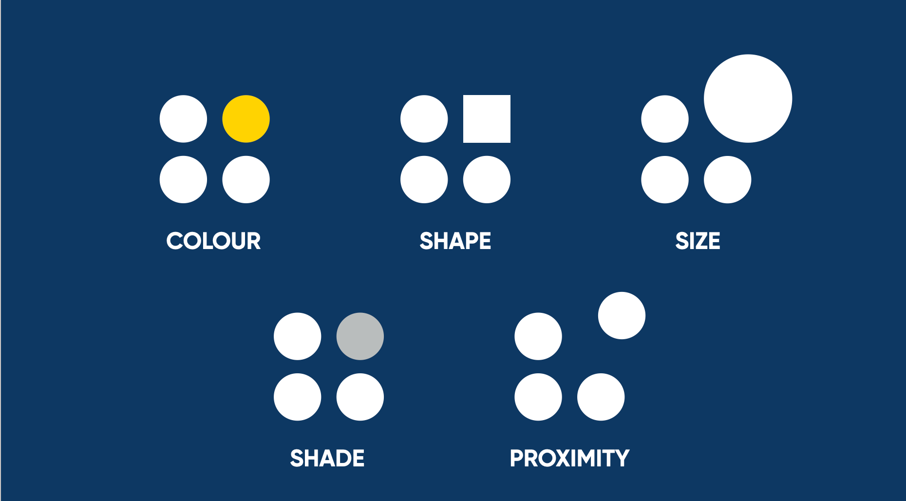
In it she explains contrast through the above visualization, highlighting how we can use contrast in our slides in a couple of different ways: using colour, shape, size, shade, and proximity. In each of these examples, you’re automatically drawn to the element that stands out.
I’ll only cover three of these in this blog post (colour, shape and size), cause shade is a variation of colour and proximity isn’t as easy to apply as the others.

Choose a colour palette
The first step is to choose a colour palette with contrasting colours.
In the case of colour, contrasting doesn’t necessarily have to mean the exact opposite – it’s more about having colours that work well together and are different enough from each other that you can see that they are noticeably different. I won’t go into too much detail here about colour theory, cause there are plenty of websites and books out there that cover this.
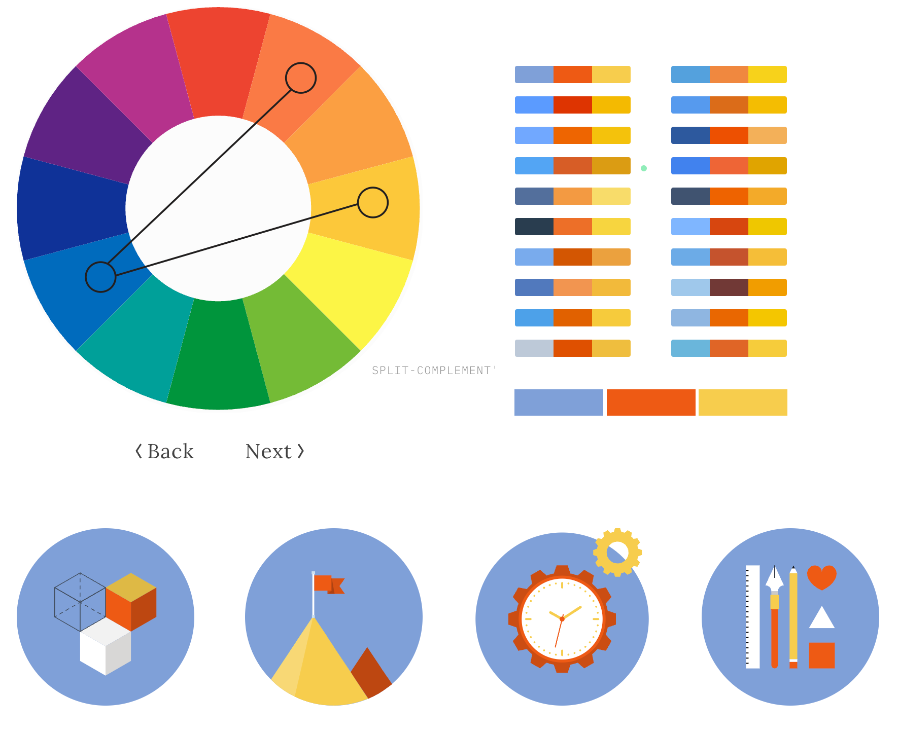
One of those websites I like is colorsupplyyy.com. It allows you to quickly try out various colour combinations and shows how the colours are situated on the colour wheel. Plus it also shows you how the colours look together in icons and patterns. So you can get a quick sense of what type of contrast you might be able to get in your slides.
One way of using colour contrast is to use it within a slide to highlight the most important phrase or data. Going a bit meta, you’ll have noticed that some of my own images in this blog post have been following exactly this pattern.

One thing to bear in mind here is that you want enough contrast between the different colours of your text to make it stand out, but you'll also want enough contrast between your text and your background to make it accessible to read. Use a colour contrast checker (like this one) to make sure your slides are still readable.
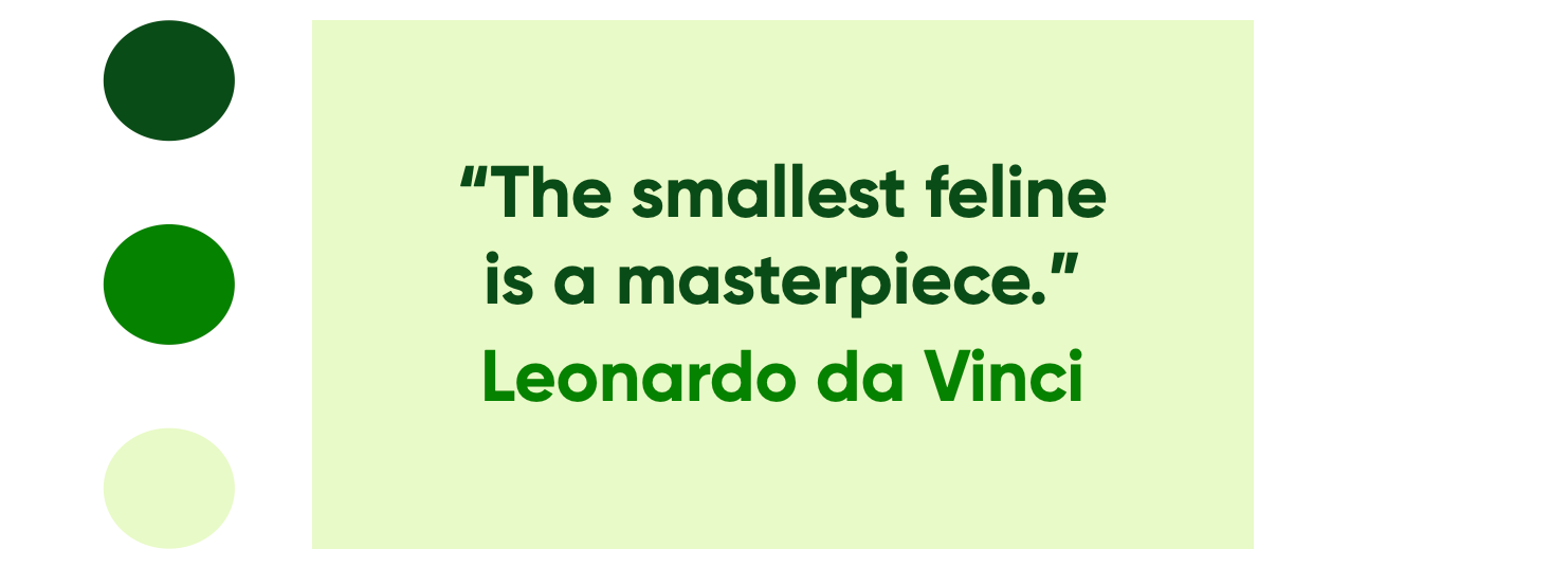
Another way of using colour is to highlight different elements on your slide. As I mentioned above the colours don’t need to be too opposite each other. In the example below, I've used the colour green and achieved contrast from the different variations of green:
Besides using contrast within slides, you can also look at contrast between slides. If you use Keynote, this is the Light Table view – where you can see an overview of all your slides. I use this overview a lot, cause you can quickly see how all your slides feel as a whole:
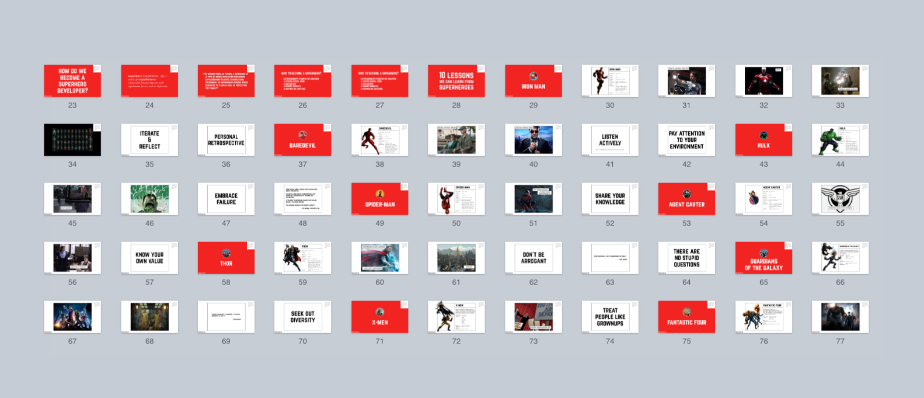
This is an overview of one of my presentations from a few years back about lessons that we could learn from Marvel superheroes. I each time used a red slide at the start of a section to highlight that we were switching to a different superhero. Because all the other slides are white, the red title slide stands out much more and makes people pay attention. It's a moment for people to stop and realise "right, we're moving on to the next section now".
So choose a colour palette to create contrast in your slides. If you use it right, it will make certain words, certain slides and certain bits of information stand out more.
Use contrasting fonts
The second way to use contrast is shape. Now traditionally when you think of shapes, you think of shapes like circles, squares, triangles, etc. And while they can be used within your slides to create contrast, those aren’t actually the shapes that we most rely on in our presentations.
What we rely on a lot are fonts. So one way of achieving contrast is through using different types of fonts within your slides. Which fonts you end up choosing is quite a personal choice, and it will depend on your presentation style and what type of feeling you want your slides to exhibit.
I tend to use custom fonts cause the fonts that are built into our systems are mostly designed for reading paragraphs of text, so they don’t quite work when on a slide, and also people are more familiar with them already and it won’t stand out as much as it could.
If you don’t want to spend anything, the first place to look for free fonts is Google Fonts. The main focus of the collection is in providing the fonts as web fonts, but you can download them too and use them in most slide editors.
If you’re willing to pay for fonts, I’d suggest taking a look at the bundles on these websites (Design Cuts, Pixel Buddha, DreamBundles, The Hungry JPEG). Rather than buying a single font, you buy a bundle of different fonts and they often include quite a large and interesting selection.
Once you have multiple fonts, you can start playing around with them to create contrast. I’ll show a couple of examples, but again this is by no means the only way you can create contrast.
In this first example, we are using different fonts within the same phrase or sentence – the contrast is used to highlight specific words. This is similar to the example above with colour within the same in line of text. We're using a unique font to make the important words stand out more, and make them more memorable this way.

The second way is using different fonts for different elements on the slide:

It’s about making it easy for the audience to understand the different purposes of those elements. Take a look below at what would happen, if it was all in the same text. It just makes it way too confusing to read and comprehend.

Using different fonts allows the audience to parse what is on your slide much quicker. The same is true for when you’re displaying code – if you’ve got multiple elements on your slide with different purposes, use contrast to show that they are different:
Play around with sizes
The third way to use contrast is size.
The simplest way of using size for contrast is just grabbing a single element and making it bigger – using it to make a statement about something. Showing the percentage for instant of a stat like in the following example will make it easier to remember:

Or you can play around and make each part of the sentence a different size. You may notice that a lot of my blog post headers follow this style:

Recap
So those are 3 ways that you can use contrast to highlight key information and make it more memorable for your audience.
What becomes interesting though is when you start pairing these techniques with each other. For instance, using different fonts with different sizes – it means that you can play around with making a slide look quite graphic:

Or try combining custom fonts, highlighted keywords and different sizes of wording together. If done well, you can create slides that look more memorable and make it easier for the audience to absorb your information.

These type of slides will stand out more and make it more compelling to people. In these cases the contrast is both within the slide and outside of the slide, making the slide more memorable.
So: make important information stand out.
Through colour, shape and size.
Stay tuned for the next post: Show AND Tell!
Disclosure: Links in this post may be for affiliates (like Amazon). If you buy a product through my affiliate links, I am going to receive a tiny commission.
This blog post is part of The Art of Slide Design series:
- Part 1: Understanding Cognitive Load
- Part 2: Maximise Signal, Minimise Noise
- Part 3: Make Important Information Stand Out
- Part 4: Show AND Tell (Coming Soon)