The Art of Slide Design: Maximise Signal, Minimise Noise


This post is part of The Art of Slide Design series. In each post, we look at a design principle to understand how to create more compelling slides. This week we'll look at the signal-to-noise ratio. Follow along and subscribe to my newsletter to get regular tips to improve your slide design and other posts about speaking, management and employee evangelism.
When I was a teenager, I had this old radio. While other kids my age were happily listening to songs on their CDs and MP3 players, I had this old radio to listen to music while doing my homework. The majority of radio stations I wanted to listen to I could easily reach, but there was this one station that was just out of reach from us. Some days I could tune in and get enough of a signal to listen clearly, but more often than not there would just be too much static. It would be too noisy to hear the music properly.
This can happen with our slide design as well: we can make our slides too noisy, too busy, and too distracting, that it takes away from what we're trying to say.
Our first slide design principle is to maximise signal, minimise noise.
This principle comes from the theory of signal-to-noise ratio (from Universal Principles of Design):
Signal-to-noise ratio:
The ratio of relevant to irrelevant information in a display.
The goal of good design is to maximise signal and minimise noise.
Universal Principles of Design: Lidwell, Holden & Butler
This is the concept that just like with radios, in every type of communication we have there is a certain amount of relevant information to us, the signal, and there’s a certain amount of irrelevant information to us, the noise.
With good designs we want to maximise the signal and minimise the noise, ending up with mainly relevant information rather than irrelevant information.
So how do we maximise signal and minimise noise in our slide designs? How do we make sure that the information on our slides is mainly relevant rather than irrelevant?
Let's take a look at it from both perspectives. First, we'll look at a couple of ways to maximise signal, then we'll look at minimising noise.

Focus on one purpose per slide
Maximising signal is all about making sure that we have mainly relevant information. In our slide design, the most important thing that we can do here is to focus on only one purpose per slide.
The moment a slide has multiple purposes it dilutes the relevant information you’re trying to get across. Rather than having a single slide covering multiple ideas or concepts, you can split them out over several slides. This is about making sure that your slide is as relevant as possible to what you are saying at that exact point in time.
Remember the previous blog post about understanding cognitive load? We want to make it easier for our audience to process and absorb the information. This means making sure that your slides support and emphasise what you're saying.
Now it is up to you to decide on what falls under that one purpose for that specific slide. Different speakers will convey their stories in different ways, and you need to decide how you break that story down into smaller parts for the audience to digest. What's the key thing that you're trying to get across right now to your audience? Focus on that specific thing as your purpose for this slide.
If you ever notice yourself talking about something that isn't related to what's on your slide, that's a sign that you should be adding an additional slide. It's something I come across a lot as a speaker coach: people are often scared about having too many slides and will end up talking for minutes to a single slide that is only loosely related to what they're talking about. I don't think you ever can have too many slides. Slides are free. Use them.
What helped me here is to regard my slides as supporting material for my audience. If someone is watching me talk and briefly looks away, can they pick up the story and what we're trying to convey from what's on the slide?
This also means two things:
- Your slides are not your teleprompter:
Because at that point they have 2 purposes: you’re using your slides to get a point across to your audience and you’re using your slides as reminders for yourself. If you need something to help you remember what to say use your presenter notes for that - cause that’s what they’re there for.
- Your slides are not post-talk notes:
Your slides are not meant as notes or references for people after your talk. Your slides are meant for the audience that is there in the room with you. If you need to share something with people afterwards, use a format that makes sense for that, like a blog post or a video of the talk.
Make your audience the number one priority.
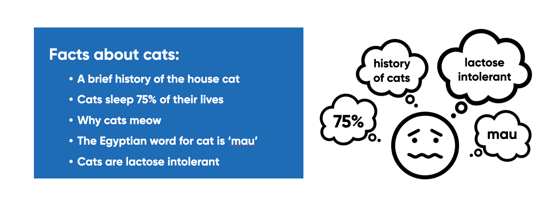
One thing I see happen a lot is using bullet points on one slide to cover multiple ideas. For instance, take this slide about cat facts. If you’re going to be talking for a few minutes about the history of house cats and then a few minutes about why cats sleep 75% of their lives and then a few minutes about each of the other points, you’re diluting the signal of each point you’re trying to make.
While you are talking about the history of cats – your audience is reading and thinking about all the other things that are on your slide already and they won’t be listening to you.
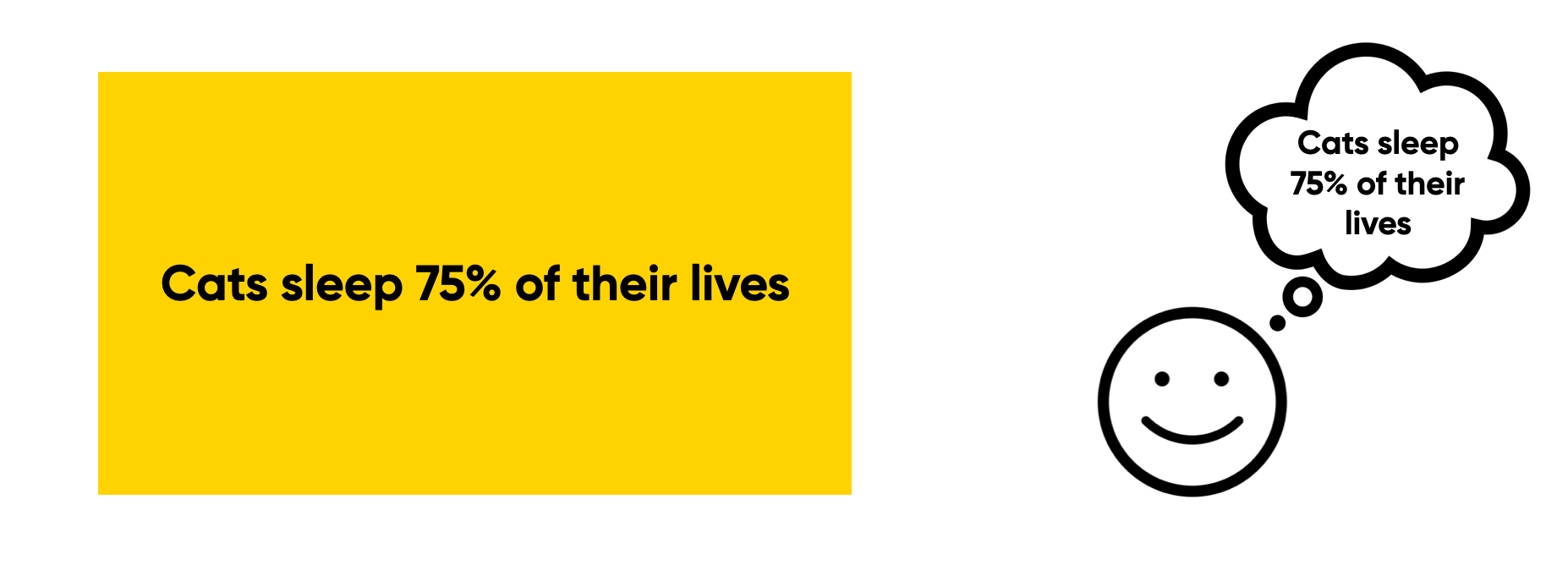
It’s much better to spit out those ideas over multiple slides. Allow your audience to focus on the one thing you’re trying to get across, the most relevant information for the audience at that time.
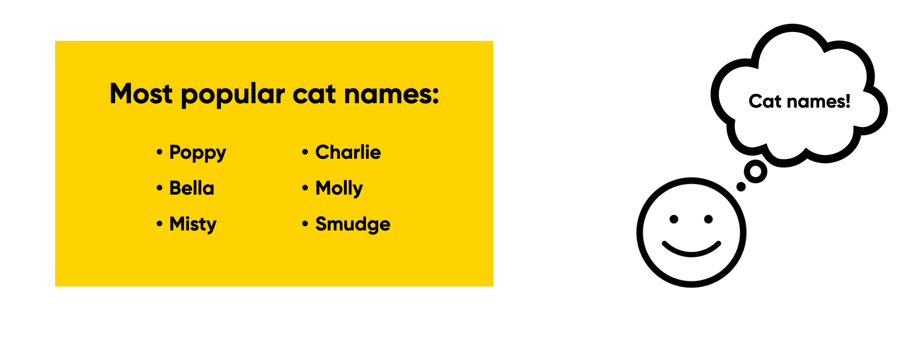
Now I’m not saying you shouldn’t be using bullet points at all, but use them to support the specific purpose of your slide. For instance, in this case, the bullet points are used to list a set of names that belong together – all the information together is what makes it relevant.
Often with internal team presentations, we need to use bullet points to show multiple topics that belong together, like OKRs, goals, next steps, etc. Again it's about what the purpose of that slide is: if the information belongs together, show it together.
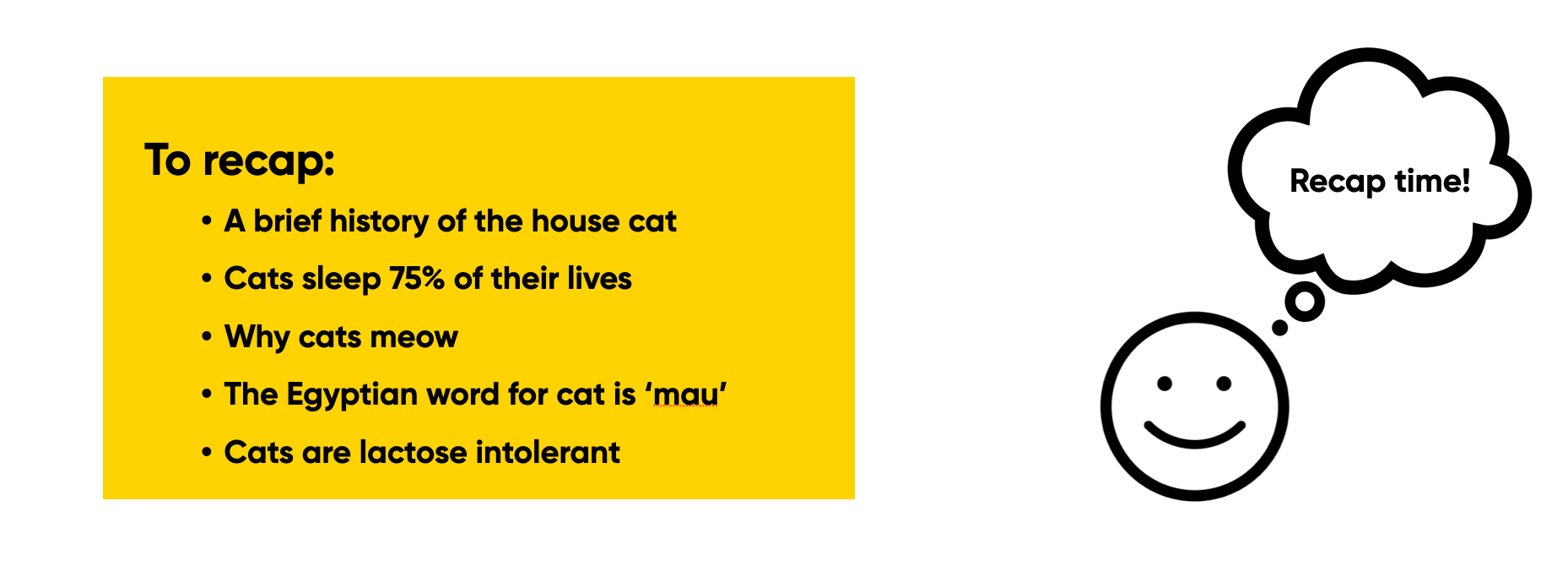
Another exception is when you’re using it to recap or to give an overview of all the things you’ve said earlier. This slide has the same content as we saw before, but in this scenario, you’ve covered each of the points separately already. The purpose is to show stuff you’ve covered before in one single slide – the audience doesn’t have to focus as much on the individual points cause none of it is new information – they’ve each been dealt with separately already.
So context matters a lot.

Don't distract
Now let's look at the flip side: how do we minimise noise? Minimising noise is all about making sure that we reduce all the irrelevant information. In our slide design, the most important thing that we can do here is to make sure our slides aren’t distracting.
In this case, we’re trying to minimise noise – ensuring we don’t have any irrelevant information that will dilute and take away from what is most important. This also ties back to the previous blog post about cognitive load. Too much noise on your slides can cause cognitive overload, making it harder for your audience to absorb your information.
I'll give a couple of examples, but the main lesson to keep in mind here is to consider whether what's on your slide is helping your audience understand the point you're trying to make. If it isn't? Then you should consider it noise.
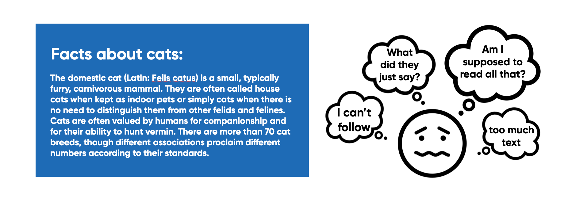
One way of being distracting is having way too much text on your slide. The moment you have a slide like this, people stop listening to you. Cause they’re either distracted by trying to read all the stuff that’s on there, or they get distracted trying to read and listen at the same time. In both cases though, it's a form of cognitive overload.
Rather than allowing your audience to focus on what you’re saying, by having that much text, you’re kicking off all these different questions and thoughts. Think about what information matters and distil it down to just the very essential. Remember that your slides are meant as supporting material for what you're saying. Focus on what would help your audience the most.
Another thing to consider here is whether or not it needs to actually be on a single slide. You might be able to break it up over multiple slides or reveal bits of information as you go on.
There may be a few cases where you can't avoid having that much text on a slide, or where you want your audience to read what's on there. In those cases though, that is the main purpose of the slide: you want people to stop and digest what is on that slide, but then you do need to acknowledge that. In those situations, you can highlight that by saying: "Yeah, there's a lot of text on that slide, so I'm going to give you a few moments to read through that." The key is about reducing the cognitive load and making it easier for your audience to digest.
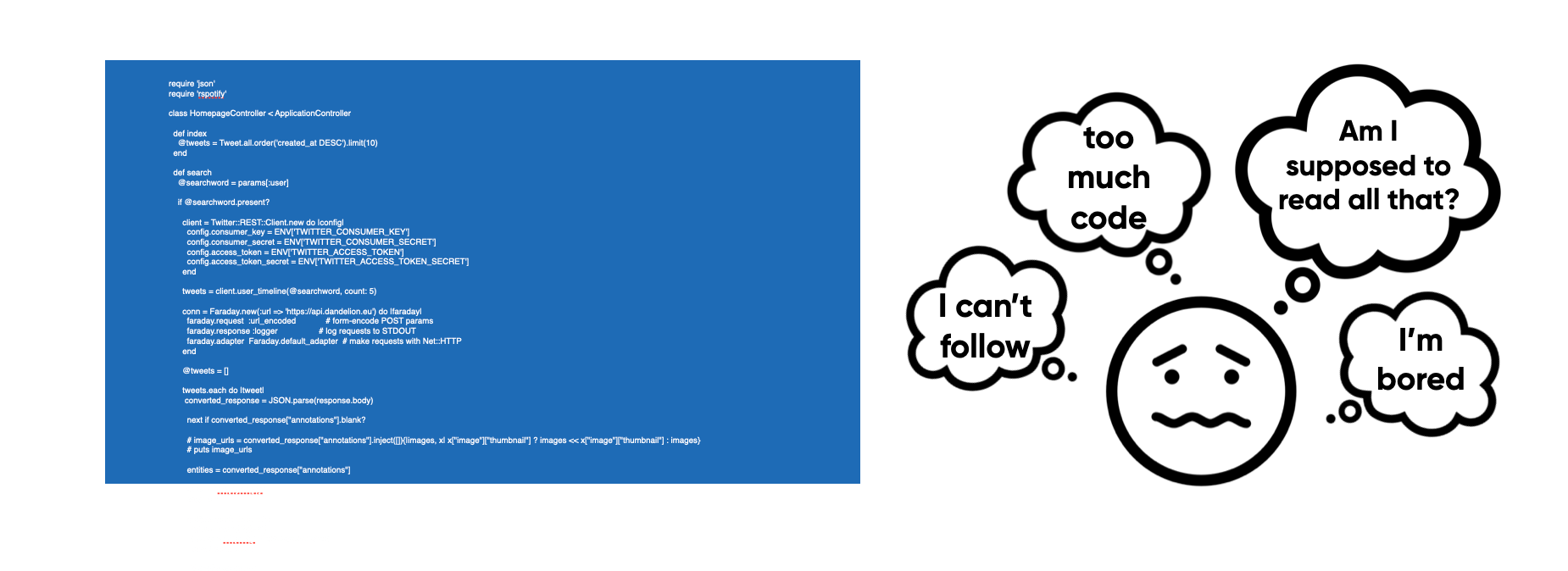
A variation of this is having too much code on a slide.
Most of the time you don’t need all of it. Instead, focus on the part that matters to the audience at that time – don’t force them to try to read all of that, cause you’re only creating a situation for people to zone out and not listen to you.
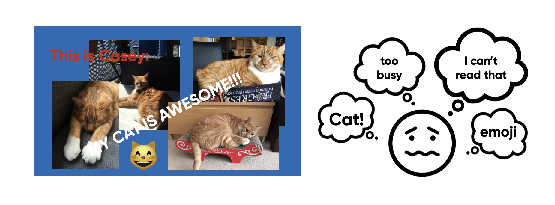
Another way slides can be distracting is when there’s just too much going on in them. This is an extreme example, but I often feel that people want to use all the space they can on a slide, making things super busy and much harder to process.

Keep your slides simple and clean so they’re not visually distracting.
This shows exactly the same images as before, but because they’re not overlapping and because there’s no text laid over it, it’s easier for the audience to process.
Recap
To recap: with your slides, you want to always make sure you're maximising the signal and minimising the noise. You can do that by:
- Focusing on one purpose per slide
- Reducing distractions on your slides
Stay tuned for the next post: Make Important Information Stand Out!
Disclosure: Links in this post may be for affiliates (like Amazon). If you buy a product through my affiliate links, I am going to receive a tiny commission.
This blog post is part of The Art of Slide Design series:
- Part 1: Understanding Cognitive Load
- Part 2: Maximise Signal, Minimise Noise
- Part 3: Make Important Information Stand Out